Tuesday, March 31, 2015

Paging the Page


Although he's last in order of appearance, this is the first Page I've done for this deck. Sometimes I wonder why I don't just start at the beginning, and move on in order until I come to the end. Instead, I bounce all anyhow through the deck, that's just the way I am, I do the cards as they come to me. It helps when you've taken the time in advance to do your research and select your base images... the last eight or ten cards I've done were laid out for me already like a roadmap. Now I'm reaching the point where I need to take a day and just sift through more images, figure out where they are going and what's ahead. 

It also helps that I basically know the card meanings this time around. When I made the Zirkus deck, I was learning as I went and a lot of extra time was taken up learning each card. I'm at the stage now where I know the basics, but an continuing to find nuances of meaning for each design.

-- Frede.

Spinning Your Wheels....


... isn't such a bad thing when your wheels are made of gold! 

I've quite enjoyed making the pentacles suit, because coins can be incorporated into a design in so many ways. It's just the swords waiting ahead of me now... and I'm not convinced that they are going to be nearly as much fun...

-- Frede.

Monday, March 30, 2015

Don't Mess With The Queen


I guess if anyone can keep Mean Ol' Mister Punch in line, it's the Queen of Swords. She's the Emma Peel of the Tarot -- grace and speed and intelligence, the water in the air. Here, Mister P. has realized that he is outmatched and thrown himself at er mercy: the only legitimate attitude to take when this queen has bested you with her swash and buckle.

-- Frede.

You Are My Shining Star


The whole process of Design is simply a matter of asking questions, and keeping on asking questions until you get a "Yes." Sometimes you have to let go at "Maybe," but the ideal even in that case is to revisit it later and keep on asking questions until you get that "Yes."

The base illustration for this one was a "Yes" right from the get-go, making the job about 900 percent easier. 

-- Frede.

Sunday, March 29, 2015

Accolades for The King


I thought it was about time for some Royalty to grace us with their presence. As The King of Pentacles this incarnation of Mister Punch is the Earthy King, The Green King, the King of Finances and the King of Practical Matters. "Thank you very much for this honor," says the Punch King of Pentacles. "Now get back to work."

-- Frede.

Saturday, March 28, 2015

The Eight of Pentacles


The art of Punch and Judy puppetry is physically demanding to say the least, but I'm guessing that it's demanding in every other way you can think of as well. Here we see a Punchman hard at his labors, with his loyal bottler at his side. It's the bottler's job to gin up the attendance, and to collect whatever bits of coinage the audience is willing to part with. Once in Covent Garden I was hit on twice by the same bottler for the same show. This is a no-no of the highest order. 

Jim Henson adopted the same style of mounting his Muppet shows and they are performed the same way to this day; albeit the Muppeteers wear headsets and have the benefit of being able to watch their performances on nearby monitors. 

All in all, a Punchman needed to be able to perform some ten or twelve characters in each show, manage scenery and special props (such as the infamous sausage machine and the sausages that come out of it) and give eight or ten performances every day. He had to be able to speak clearly despite having to hold a device called a swazzle in his mouth: it is the swazzle that gives Mister Punch his distinctive reedy voice.


In this design I laid the coins down as if they were sitting in he bottom of the bottler's "bottle." The intent was to show the proceeds of hard, honest labour, but I'm not sure I like them that way, and may
"pick them up" and float them in the air conventionally. What's your vote?

-- Frede.
www.tarotbyducksoup.com
www.ducksoup.me

Spud Lite Makes it Right


It's doubtful that the Mister Punch of the puppet plays ever did an honest day's work -- but the cartoonists of Punch magazine drew him in nearly every situation or walk of life that you can think of... and here he is diligently working at the harvest.

-- Frede.

Friday, March 27, 2015

The Six of Coins


... and here we see Mister Punch himself serving up the Christmas pudding to the orphans.

Well. nobody's all bad...

-- Frede.

Sunday, March 22, 2015

A Rolling Coin Gathers No...


So much for a "Marseilles style" deck with just pip cards ("It'll be easy that way -- I can do a while suit in a day!"  -- Hah!) ... the illustration mode seems to have taken over the minors since I discovered a cache of Punch cartoons. Oh, well. Considering that I really don;t know what the hell I am doing and am just making it up as I go along, I think these are turning out OK...

-- Frede.

Midas Man


With this card, I am exactly halfway through the deck! Yee-haw! It's appropriate that Mister Punch seems as exuberant as I feel right now; here on the Midas card, we catch Mister P at home, happily playing with his money. It was a late decision in the design to throw three of the coins into perspective, and I'm so glad that I did! 

In the original illustration, Punch is shown kicking a globe of the Earth. I suppose it's barely possible that this is where Charlie Chaplin got the idea for his famous globe dance sequence in The Great Dictator... Charlie would have been in his formative years, well before moving to Hollywood, when the drawing appeared in the pages of Punch magazine.

Onward! It's all down hill  from here, right?

-- Frede.

Saturday, March 21, 2015

The Gold Balloons


We;ve heard of journalists trying to stay above it all, but this is carrying it a little too far... though in cleverness it may just qualify Mister P to appear this way on the three of pents.

Just for fun, here again is the image that I started out with:

--Frede.

Friday, March 20, 2015

After Pamela


There's so much to read and learn about Tarot on the web and in little white books and in apps and historical texts that I haven't actually bought or wanted to buy a book on the subject since my first, Mary Greer's Tarot For Your Self. But now I find myself actually looking forward to the release of a new tarot book -- specifically, Secrets of the Waite - Smith Tarot by Marcus Katz and Tali Goodwin. Why? Because it's the first positive proof that Pamela Colman-Smith had much more influence on her deck than has previously been publicly acknowledged, and because the authors have done the research and can now show us exactly what the artist was thinking when she created the images. All artists are influenced by something, and there's a kind of joy in learning the connections between Colman-Smith and her influences. The website that the authors have set up to tease the book's release has already provided a wealth of information, and one of my favorite entries there centers around the enigmatic two of pentacles. 

You have to admit that the imagery Colman-Smith came up with for the card does support the many and various interpretations that have been assigned to it down the years... including my own oddball take on it in my Tarot of the Zirkus Mägi, where I used VIRTUOSO as the keyword.

For this deck, for this card, I specifically focused on Marcus and Tali's revealed interpretation, "False promises, deliberate miscommunication," and "the mercurial nature of communication."

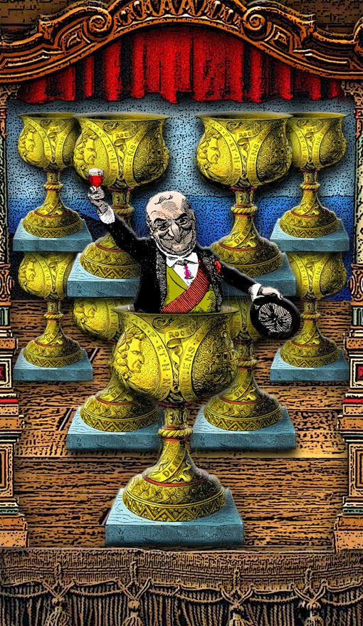
Mister Punch is nothing if not a Trickster Figure himself, which is part of what makes him the perfect subject for a tarot deck. He is not to be trusted. The editors of the long-running British humor magazine Punch seem to have known that and incorporated it specifically into much of the magazine's cartooning, including the famous cover art showing Punch painting a portrait of a noble and royal British lion -- using his dog Toby as the model!

I had planned to use this image in another part of the deck, but based on the excerpt from Marcus and Tali's book I thought that it fitted better here.

And it does -- although making it work visually turned out to be a royal pain in the ass!! 

Although I had access to a high-definition scan of the cover, the artwork was still too dense and would not "clean up" sufficiently for me to color it using my normal methods. I was forced to resort to several other techniques that I'm not so comfortable with and that I actually kind of dislike... and the results were extremely frustrating. I reconsidered coloring it at all -- but just slapping the scan into the card didn't go down well with me, and clashed visually with everything else I've done on the deck. After many hours, just by sticking with it and not giving up, and applying layer after layer of color and shadows along with some judicious filter work, I finally got the result that you see above... and maybe it's just because it gave me so much trouble and looked so very butt-ugly for most of the time that I was working on it, but I'm at last extremely happy with the result. Just so you can see how far I went and how much I did, here is the image I started with:


-- Frede.

Ace in the Hole


This may look like a simple design, but 'twearn't. I spent as much time just getting Mr. Punch's head embossed onto that GD coin as I've spent on entire cards. I think the effort paid off, though, and the finished pound will make the suit of coins look that much better as it begins to proliferate across the cards. So. There. Ready for more coffee now.

-- Frede.

The Card Back Design


I'm very much enamored with this as the card back design, although the temptation to "do things" to is hard to resist. I wasted a lot of time trying to distress it up -- but the image is complex enough without all that faux aging turning it into a pile of mud. The lineart just doesn't bear all that extra dicking around. In the end, I settled for darkening the edges very, very slightly. It could stand a little more of that, IMHO. But -- it kind of doesn't matter what I do to the thing: People are going to be able to change it out and customize the card back any way they want (including this design in different colors: a burgundy or a deep blue might be nice), so at this point my best bet is to just let it speak for itself and move on...

--Frede.
www.tarotbyducksoup.com
www.ducksoup.me

Thursday, March 19, 2015

Another Card You Don't Want to Draw....


It's been a long day with two of the most depressing cards in the deck. Time to get dinner for the pussyquats.

-- Frede.

Switching Out Swords...


Or, "There Will Be Blood."

This started out to be, and for a couple of hours was, The Three of Swords. Then it abruptly took a left turn and morphed into the Ten. All Magic is like that. Sometimes no matter how carefully you watch what you are doing, a spell goes off in a different way than you intended and you end up with completely different results. 

I'll have the three for you later on.

In case anyone is put off by the stage blood, I do feel that some acknowledgement of the puppet play's savagery needed to be made somewhere in the deck -- and where better than the ten of swords?

-- Frede.

Wednesday, March 18, 2015

The Sun


As above, so below...

-- Frede.
www.tarotbyducksoup.com
www.ducksoup.me

At Last -- The Wands are Done!


Although I'm still not halfway through, with two suits of the minors, two Court cards and assorted entries into the Majors I am closing in on the halfway mark. I want to see if I can cross it by Sunday night. Will I make it? Not even Mister Punch knows. 

As he does in many issues of PUNCH magazine, here Mr. P wields pens as a weapon. I like this a lot, not just for the obvious symbolism, but because many old Marseilles-style decks have wands that look distinctly (to my eye) as if they were pens with nibs. Here, I counted both the bow and the arrow towards the final total of eight. I originally intended to have all the wands in flight, but it looks better (and I don't think it hurts the meaning) if our jolly friend still has some "in his quiver," so to speak...

-- Frede.

Tuesday, March 17, 2015

Stumbling In


Sometimes -- most often, in fact -- I'll start a design with little or no idea where in heck I'm going with the thing. I guess in general you could describe my workflow as "begin without a clue, then dick around with it until something seems like it might start to come together, and try not to make it look like complete rubbish." That's certainly the process I went through with this one. The ten of wands is all about burdens, and there just isn't a lot of Punch-related artwork out there that shows old Mr. P having a rough time of things -- he's usually the one who comes out on top in every situation. The best I could find was an old Victorian-era Christmas post card showing Mr. Punch stealing a gigantic Christmas pudding. I winged it from there, not knowing until the very end if it was going to come together or not. Very frustrating when you've got ten effing wands that each have to be moved around individually. I grouped those suckers as soon as I possibly could, and from there my life got steadily easier...

-- Frede.
www.ducksoup.me
www.tarotbyducksoup.com

Friday, March 13, 2015

Seven Wands, Seven Clubs, Seven Batons... just ... Seven.


I started this one last night -- then found a real treasure trove of Punch artwork and set it aside for a moment. Today -- I must have looked at about 900+ images of Mister P, and not one of them was better for this card than the one I started out with last night. 

This is about as clearly derived from Colman Smith imagery as it can possibly get with a deck of this sort. I keep telling myself that this is supposed to be a simple Marseilles style deck with just cute little decorative arrangements of suit symbols on the pip cards, and I keep straying away from that. *sigh*

The base image is pretty much as-is, although I did go to the trouble of cutting out Mister Punch and isolating him on a separate layer, so that I could create the shadow effects around him. 

Whoever raises a club against Mister Punch does so at their own peril!!

-- Frede.
www.ducksoup.me

Wednesday, March 11, 2015

Let's You and Him Fight


Mister Punch is such an evil SOB that the tends to infuriate all those around him; some of them actually sink to his level. But it's never a good idea to engage the hook-nosed-one in fisticuffs, because he will beat you with his stick. That, after all, is the way to do it.

-- Frede.

VI is for Victory


I wanted to put a crowd of people around Mister P as he makes his triumphal march; but it was too busy, too noisy, too confusing. Sometimes less really is more.

-- Frede.

Tuesday, March 10, 2015

What Did We See? We Saw the Sea.


My intent was to make the Minors non-illustrative pip cards, and so it remains... but when a perfect thing throws itself in your face you've GOT to follow, right? So... that's what happened here.

-- Frede.

Monday, March 9, 2015

Two By Four


You can click on these to enlarge them.

Midway through my design for the two of wands, I realized that it could not be the two of wands, that it MUST be the four of wands instead. Can you see why?

Well. I immediately made the switch, which gave me a fine four, but left me with a decision to make about the two. As the two of wands is all about "the moment of decision" anyhow, I went with a decisive portrait of Mister P himself. With his sly expression, he knows exactly what sort of jiggery-pokery I've been up to with his cards...

-- Frede.
www.ducksoup.me

Sunday, March 8, 2015

Nine Wands = A Lot of Wands


AAAA! Look out! there are wands everywhere! AAAA! Look out!

-- Frede.
www.ducksoup.me

A King in his Cups


Well now. This may be my favorite card in the deck, and until a couple of hours ago I had no idea what in heck I was going to do with it. 

A couple of years ago I took a photo to go into the book Melies' Notebook and Other Stories, as an illustration for my short story called, you guessed it, "Punch & Judy." Mr. P. and I go a little way back. Well, I wanted to use that photo in this deck... somehow. It had never been printed in full color and I was kind of proud of it. FYI, the photo shows almost the entirety of my modest collection of Punch stuff. 

I was working on the suit of wands this afternoon, going through the art that I have on hand, and I looked at the photo again, kind of wistfully, wishing that I knew how in heck I could work it into the deck. Then I focussed on the little teacup. and the coin dropped. Of course! It was the King of Cups.

I dropped what I was doing and set about making the new card. Immediately I ran into a problem: in making the original photo, I'd artified it up and scratched the hell out of it and antiqued it to within an inch of its life: and it just didn't WORK within the framework of the deck design. ARRRGH!!!! 

I had no choice but to go back, pull down my Punch stuff, and re-shoot the photo from scratch. Of course I did artify it after the fact, but in a milder way and one that better matches the style of the deck. The last and most fun thing that I did was tip in another layer so that I could have Punch's little foot dangling over the edge of the stage.

An easy card to make, a FUN card to make, and one that I have an emotional connection to, because it makes use of things I feel connected to.


And just for yucks, here's the original photo, the one I couldn't use in the deck. You can click on it to enlarge:


Thanks for taking this journey with me!

-- Frede.

Saturday, March 7, 2015

The Ace of Wankers


The -- erm -- Freudian symbolism of this card (especially the way Pamela Colman Smith and others have drawn it over the years) has always been a source of crass, juvenile amusement to me. And yet Mister Punch is nothing if not what's known as "A Great Wanker."

I never know how these things are going to turn out when I start them, even if, as was the case this time, I have a clear idea going in of what I want to do. So when it works out it's always a source of surprise and pleasure... and I think this one does the job.

-- Frede.

Friday, March 6, 2015

La Lune


This is turning out to be a more personal deck than I intended or else admitted to myself that it would be. If that makes any sense. I thought this was just a simple, obvious idea, an easy knock out of the park. But it turns out, as usual, that there's more to the damn thing than what I planned on. The creative process has a way of ripping things out of the old subconscious... which is appropriate here, as The Moon is all about ripping things out of your subconscious, whether you want it to or not. 

Y'know... it's late at night as I type this, and night is when these feelings come calling, mostly at inconvenient times... but there are moments when things eat at you. I so wish that my grandparents and my mother were still alive to see the projects that I'm working on and to see that I'm actually succeeding at something... which none of them got to see in their lifetimes. I think they's all get a bang out of the work that I'm doing now, and it's sometimes a physical pain knowing that I can't show it to them. 

The Moon is a tricksy devil. 

-- Frede.

Thursday, March 5, 2015

When We Were Lovers...


This one took the longest of any card design so far with this deck: nearly two full days of work went into it, divided by a couple of weeks. I still think the Crystal Palace is too.... something. I dunno. Other than that, I'm feeling pretty smug about this one. Part of the difficulty was in trying to decide how much of the original image to spare, and how to juxtapose the parts of it that I was keeping. At first I tried to keep too much of the original image. 

Here's what it looked like when I started:


As you can see, aside from stripping away almost everything, I had to "take in" the Crystal Palace a little bit.

I scanned this direct from an old leather-bound volume of a collected year's worth of PUNCH magazines. This book is one of two major sources for base illustrations, but it's a little frustrating because there's not as much there as I would have liked. Back in the old pre-computer days when my mother was making art jack-in-the-boxes, she went through this volume and, to my lasting and absolute horror, cut out some of the best images to use on the box papers -- and those images are now gone. *sigh*

Art is much less destructive in the digital age.

-- Frede.
www.ducksoup.me

Tuesday, March 3, 2015

Quaffing from the Full Cups


The eight and nine. Click to enlarge.


Not counting the Court Cards, which are a whole separate animal that's still snarling at me in the corner, the suit of Cups is now complete! All three of these last invoke Waite-Smith meanings, while still trying to be simple Marseilles-style designs. It seems that I can't do anything the easy way, no matter how hard I try.

I hope you like. 

-- Frede.
www.ducksoup.me